Edcetera
-2025
Website UX / UI, Copy Direction, Front-End Implementation
Overview
Edcetera is a professional education provider offering exam prep, CE, and career support for licensed professionals and institutions across healthcare, skilled trades, and more. The organization sought a website refresh to better reflect their evolving mission, clarify user experience, and support growth through more strategic content hierarchy and visual design.

Challenge
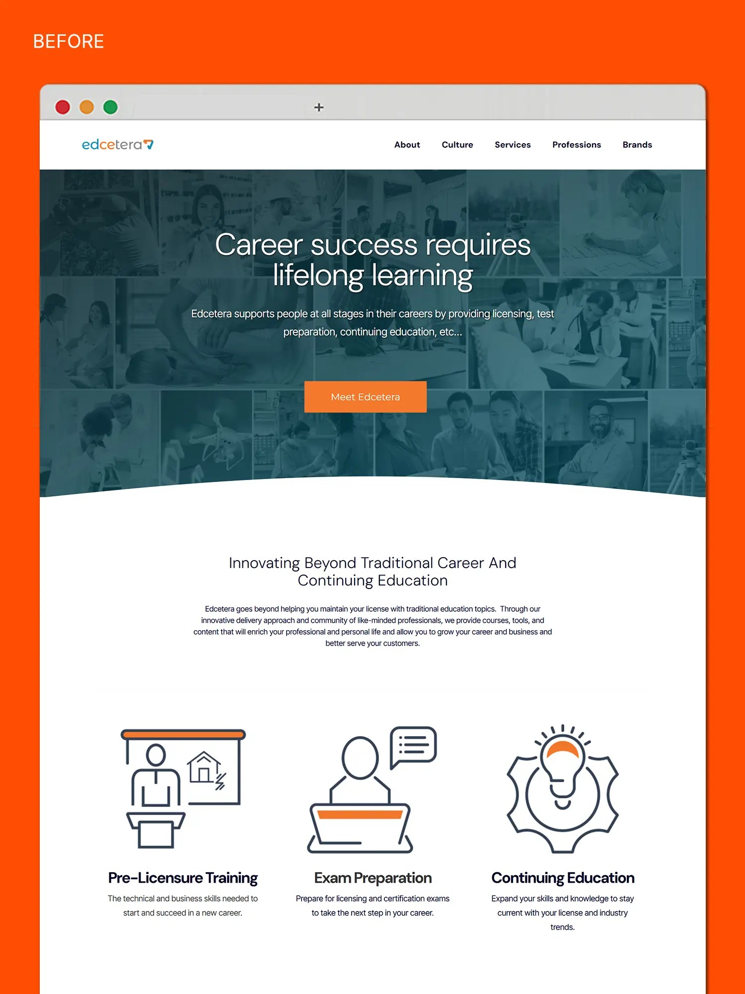
The previous website lacked hierarchy and visual clarity. Core service areas such as Pre-Licensure Training, Exam Preparation, and Continuing Education were not distinctly presented, and primary calls to action were not consistently emphasized across key pages. Several pages contained dense copy with minimal visual support, and mobile layout inconsistencies contributed to a disjointed user experience. Additionally, there was a growing need to speak to both direct consumers and B2B audiences without diluting the message.


Approach
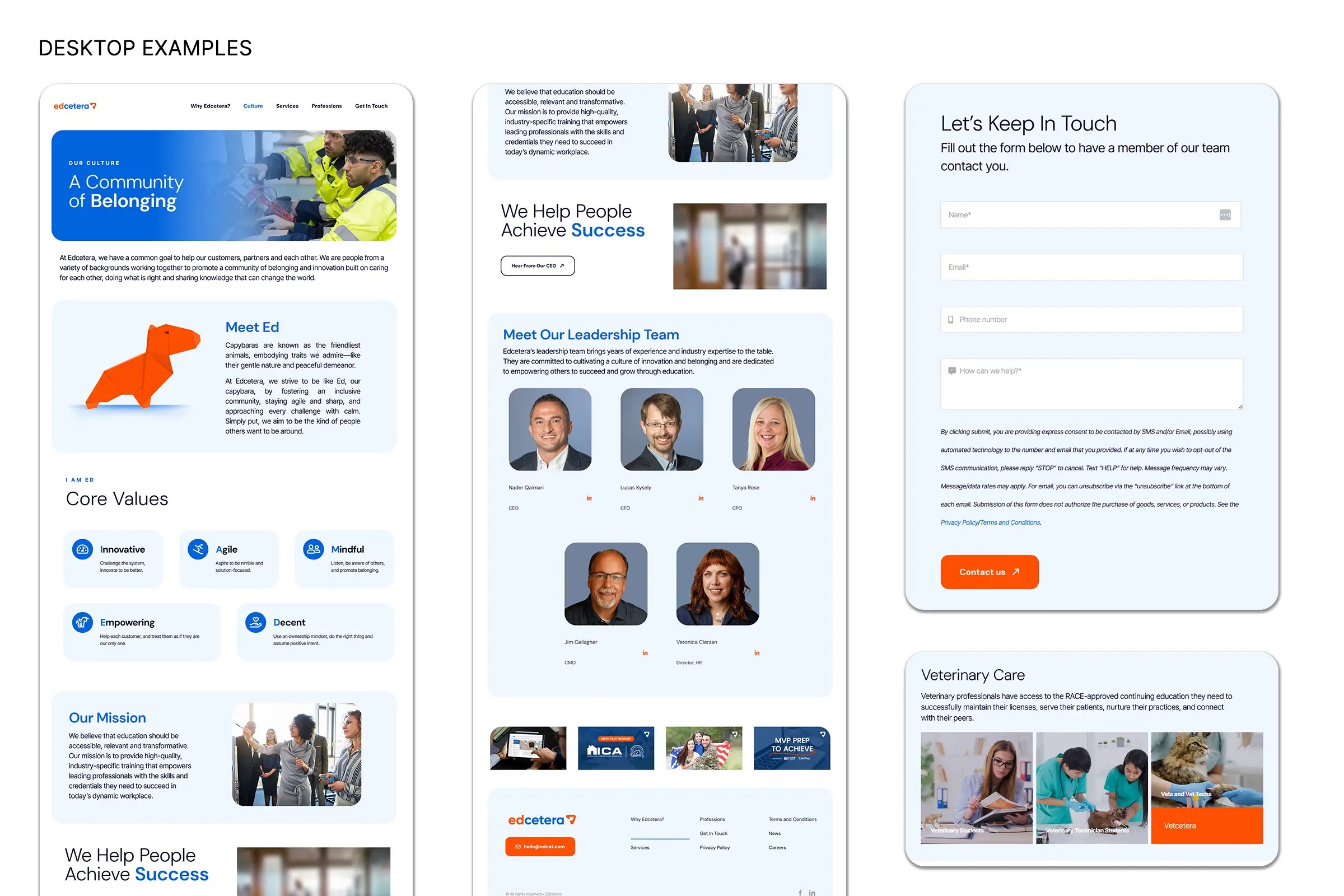
The redesigned site architecture introduced clear, modular pathways for two distinct user groups: professionals seeking continuing education and licensing resources, and organizations exploring partnership opportunities. Each section was redesigned to guide the user through intuitive next steps using refined navigation, consistent visual patterns, and targeted messaging.
Service categories were defined visually through icon systems and supported by direct CTAs. Layouts were rebuilt to create visual breathing room and reinforce messaging priorities across all devices. Updated copy was introduced throughout to establish a confident and credible tone while remaining accessible.
Key updates included:
Global image optimization to WebP format and updated hover states, spacing, and type hierarchy for system-wide consistency
A restructured homepage with streamlined messaging, service highlights, and directional CTAs
A refreshed Why Edcetera page featuring the Edcelerate community and value propositions for institutional partners
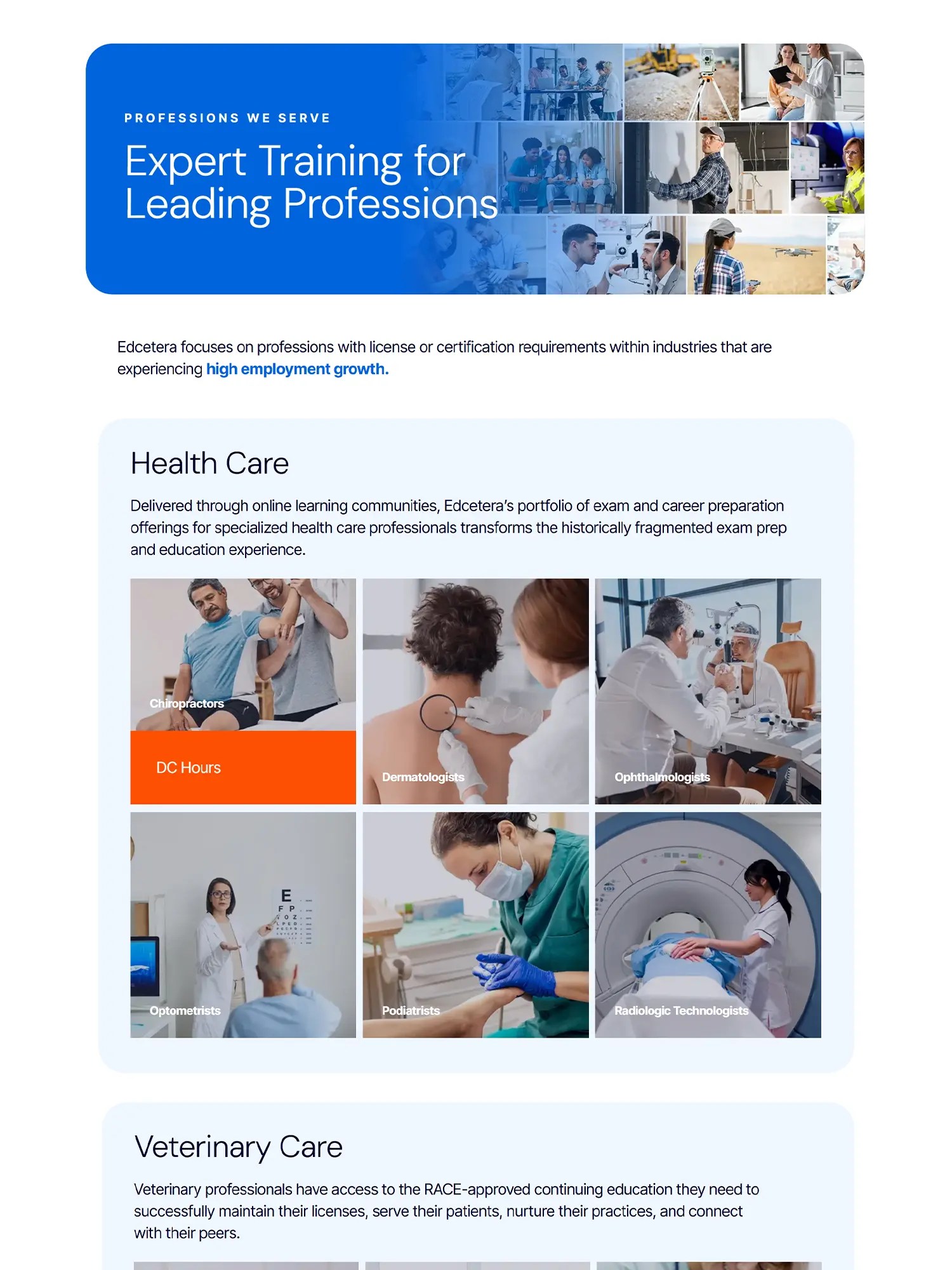
Redesigned Professions and Brands pages with consistent visual treatment and improved readability
Culture page was rewritten and redesigned to support both internal and investor-facing communications

Results
The redesigned site presents a cleaner, more modern interface with clearer calls to action and defined user journeys. Layouts are modular and scalable, allowing for future brand growth and content expansion. The refreshed experience helps position Edcetera as a trusted partner for both learners and institutions.